Aero Adapt
Web Experience + E-commerce

After scrutinizing the website data provided by the project manager, it came to light that approximately 50% of users initiate a session by visiting the website but end up abandoning the page after viewing roughly seven items. This observation leads to the suggestion that the issue at hand may stem from users encountering difficulties in discerning which bike is the superior choice for purchase based on its relative features. Furthermore, it was also observed that a significant 70% of users who take the step of adding an item to their cart ultimately abandon their carts and exit the browser upon reaching the registration page. This phenomenon raises the hypothesis that users perceive the registration page as overly cumbersome and time-consuming, thus deterring them from completing the checkout process.
Problem Statement:
Using the Figma template provided, the website was redesigned using the brand’s new identity. The customer confusion when deciding which bicycle to purchase was addressed by adding a component where users could “compare” their selected bicycle with other options. By giving them the easy option to swap the bicycle in their cart, the user feels they have more freedom to compare side-by-side information without the added pressure of having multiple bicycles added to a wish list or in their shopping cart. A guest checkout option was also added to the design to allow users to skip the signup process with only an email. This decreases the repetitive task of inserting one’s personal information and gives users a sense of security that their sensitive data will not be stored.
Proposed Solution:
Primary Research: User Interviews
To gain a deeper comprehension of our target demographic, which primarily consists of middle-aged men who are avid and competitive cyclists, a series of user interviews was undertaken. These interviews were conducted at a popular, high-traffic bike trail where the target users frequent. During these interviews, participants were queried regarding their motivations for cycling, their specific requirements, and their aspirations while engaging in cycling activities.
70% of interviewees stated they have a preferred brand to utilize when competitive biking.
80% of interviewees stated they utilize accessories to improve their bicycles overall performance.
70% of interviewees stated they desire the ability to add warranty to their bicycles.
90% of interviewees stated that the price plays an important role when purchasing a bike.
100% of interviewees stated that performance is the leading factor when deciding a bike.
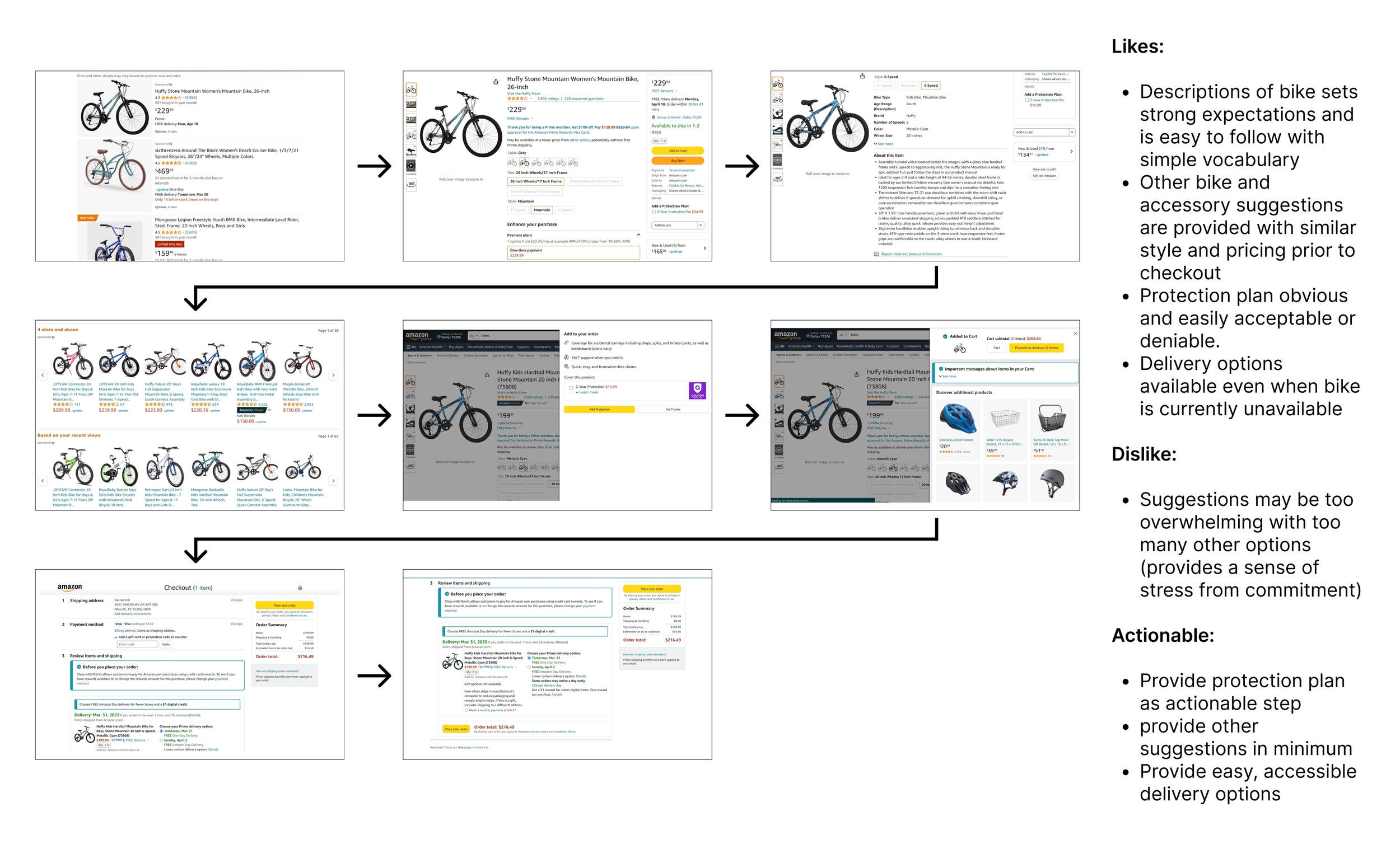
Following the acquisition of valuable insights into the needs and desires of our target audience, we initiated a comprehensive competitor analysis utilizing e-commerce websites that exhibit an experience in bike sales. The aim was to gain a profound understanding of the existing standards within the bicycle e-commerce sector and to discern the facets that exhibit effectiveness, as well as those that might benefit from enhancements. This approach sought to refine the platform, aligning it more precisely with the preferences of competitive cyclists, as opposed to the broader demographic of general bikers who employ these platforms for commuting, leisure, or exercise purposes.
Competitor Analysis
Amazon
Trek Bikes
Target
With these insights in hand, we proceeded to craft user flows meticulously designed to optimize the journey undertaken by our target audience when acquiring high-performance bicycles tailored for competitive cycling. Our intention was to capitalize on the crucial components of the user experience that hold particular significance for them. These user flows underwent a thorough process, involving creation, review, and subsequent refinement, ensuring the incorporation of elements that would enhance the overall user experience and stimulate users to seamlessly progress through the checkout process from initiation to completion.
User Flows
Our commitment to providing a comprehensive user experience led us to meticulously curate filtration options encompassing all components influencing a bike's performance and aerodynamics. These filter selections were aimed at facilitating users in their quest to identify specific bike brands, parts, and accessories aligned with their competitive cycling aspirations. In this endeavor, we crafted an affinity map, which was then thoughtfully presented to ten participants within our target audience. Their feedback and additional insights derived from secondary research were instrumental in refining the filtration choices, ensuring a maximized experience.
To further diversify the accessibility of the website, we also incorporated a search bar option. This addition serves to enhance user convenience, enabling them to seamlessly explore the platform for the desired products that align with their competitive cycling needs.
Affinity Mapping
Prior to the culmination of our high-fidelity design, we crafted low-fidelity sketches. This strategic approach not only facilitated efficient time management but also enabled guerilla usability testing and subsequent iterations. These preliminary steps were instrumental in refining the presented design to ensure it resonated optimally with our target audience.
Low-Fidelity Sketches
The high-fidelity design underwent rigorous user testing, and the subsequent feedback yielded crucial insights. The revisions were thoughtfully directed at preserving information hierarchy, elevating the visual aesthetics, and, most importantly, enhancing the user-centered experience. Notable changes encompassed the introduction of a "go to cart" button, replacing the "checkout" option within the bike comparison section. Additionally, the login page title was refined to a more user-friendly "Have an account?" query, and the shipping details section now incorporates a carrier input. Perhaps the most pivotal transformation entailed adding a "Home" option to the main navigation bar on every screen. This adjustment guarantees uninterrupted access to the website, alleviating any potential confusion about clicking the main logo for home navigation. These refinements collectively aim to bolster the website's usability, cater to user preferences, mitigate errors, and sustain a harmonious brand identity. Below, you'll find the culmination of these design enhancements.
High-Fidelity Design
90% of participants interviewed found the user flow easy to follow and were able to identify their desired bike characteristics.
90% of participants interviewed found the bike comparison page beneficial and stated they would feel more confident making a larger purchase.
100% of participants interviewed reported the design as usable and accessible, making their bike purchasing experience more enjoyable.


