eMerge
Entertainment + Socialization Application

Problem Statement:
Young adults struggle to make new friends and feel isolated as they transition into adulthood post Covid-19, often due to a lack of expectations and discomfort in new social situations.
Proposed Solution:
Create an application that empowers young adults to build meaningful friendships by providing comprehensive insights into events, real-time guidance, and community support, leading to improved social skills and overall well-being.
Comprehensive Overview
Secondary Research
Integrated secondary research was crucial for creating an app that promoted social events to facilitate friendships. This research revealed user needs and behaviors, enabling me to craft an intuitive and distinctive user experience. My findings also highlighted that young adults, navigating the transition to adulthood, faced elevated emotional needs due to rapid life changes, often leading to social challenges. This was exacerbated by information overload, which induced uncertainty.
Facilitating supportive relationships through the app could help reduce stress and emotional volatility in young adults.
Screener Survey
The screener survey was instrumental in narrowing down our target audience for the ensuing user interviews, specifically individuals between the ages of 21 and 39, who expressed a genuine desire to enhance their social connections and were likely to be active users of our application.
User Interviews
User interviews played a pivotal role in the UX research process by offering insights into user needs, objectives, and challenges. Engaging with five participants, I acquired invaluable information regarding their emotional dynamics in the realm of initiating and nurturing friendships. These insights became the guiding force behind the app's design and feature set, ensuring it effectively aligns with users' friendship aspirations.
During my research, it became evident that people primarily sought comprehensive information and clarity concerning social events. This included details about attendees, activities, associated costs, and the opportunities for forming meaningful connections.
Competitor Analysis
When evaluating competitor applications with functionalities related to social connection, friendship-building, and event participation, it became evident that our application needed to incorporate key elements shared by these competitors. Drawing inspiration from platforms such as Facebook, Google, and Meetups, we aimed to offer a sense of familiarity to our target users while retaining uniqueness. Notably, our application's distinctiveness lies in its commitment to Nielsen's Heuristic of minimalism. We streamlined our app's purpose to focus solely on facilitating event attendance for meeting new people. In doing so, we maintained high standards, consistency, and empowered users with control and freedom over their interactions.
User Personas
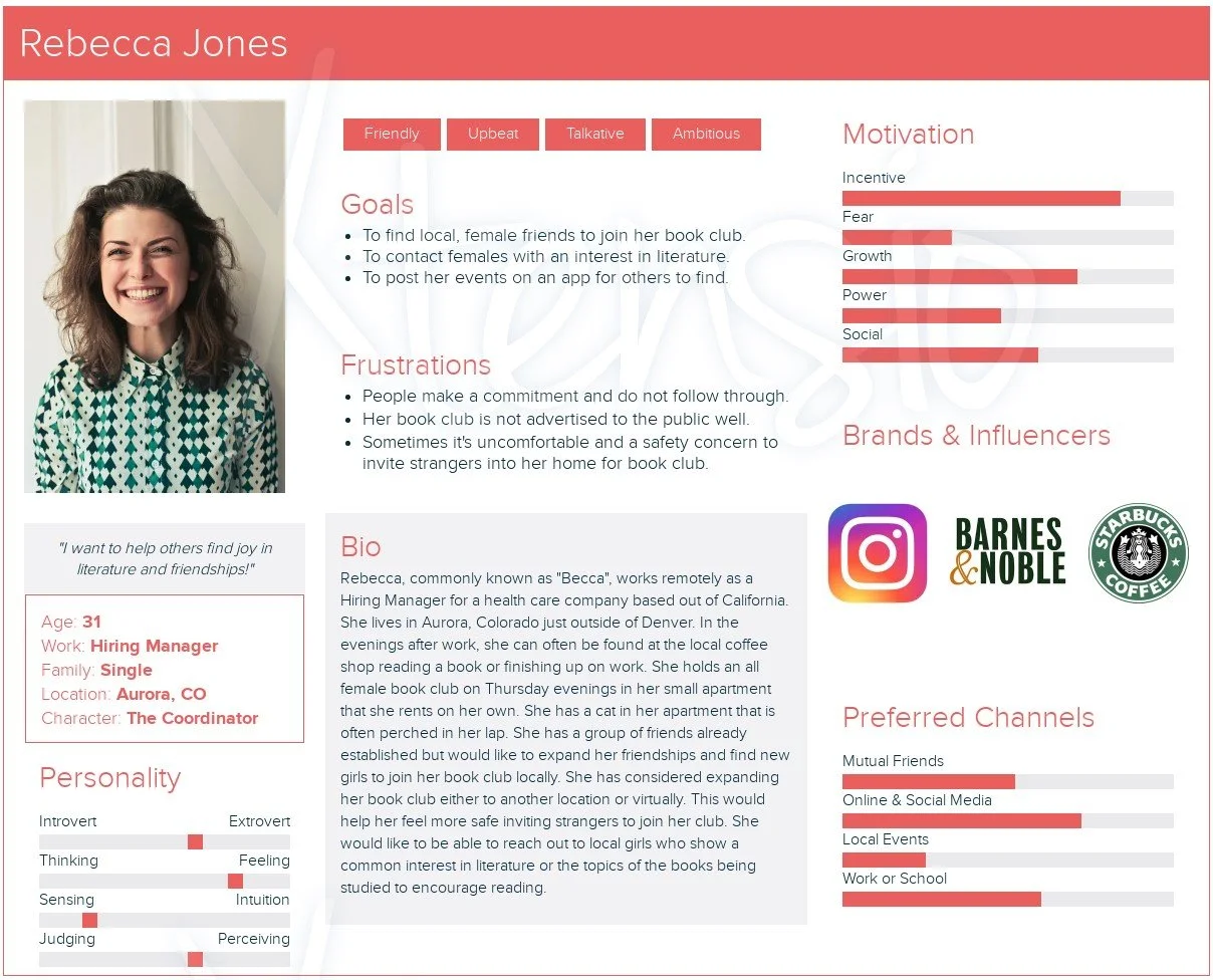
The initial stage in cultivating empathy for individuals seeking to forge friendships via organized events involved comprehending diverse viewpoints and objectives that potential users might harbor. To capture a broad spectrum of personalities representative of our target audience, aged 21 to 39, I deliberately selected two contrasting perspectives.
Empathy Mapping
To maximize the utility of this data, I crafted an empathy map for each individual, delving deeper into their life goals and how friendships intertwined with these aspirations. I empathized with their aspirations, challenges, hopes, and vulnerabilities, striving to gain profound insights into how my application could effectively assist users.
By employing the empathy map, it facilitated a profound connection with male users. Building friendships can be more challenging for men due to their higher expectations of maintaining a leadership role. They often project a tough exterior, downplaying the significance of friendships, yet secretly fear rejection. In their relationships, they seek value in connections that stimulate their intellect and aid in achieving their goals, fostering a sense of accomplishment and success.
Through the empathy map, I delved into the mindset of women who approach friendship development differently from me. As someone who typically awaits others' initiatives for friendships or ideas, comprehending a woman eager to be the catalyst in forming connections provided valuable insights into the processes individuals undertake to foster friendships.
In conclusion, crafting user personas and empathy maps allowed me to recognize a common thread among all individuals aged 21 to 39. Loneliness and insecurity are common, with a shared aspiration to achieve life goals and build relationships that enhance their path to happiness. This understanding informed the creation of an application that preserves the dignity of young adults while offering them the gradual boost in confidence and convenience required to attain these objectives, ultimately alleviating negative thoughts or feelings towards relationships.
Defining The Problem
The final preparatory step before embarking on the ideation process involves the precise definition of the problem to be addressed. This definition serves as a compass, ensuring that the generated ideas align with the overarching objective. To define the problem, we employed four succinct questions, each designed to provide crucial answers necessary for achieving the goal of fostering friendships by means of event attendance. These inquiries were derived from four distinct 'jobs-to-be-done'.
Jobs-To-Be-Done
How Might We Statements
User Flow
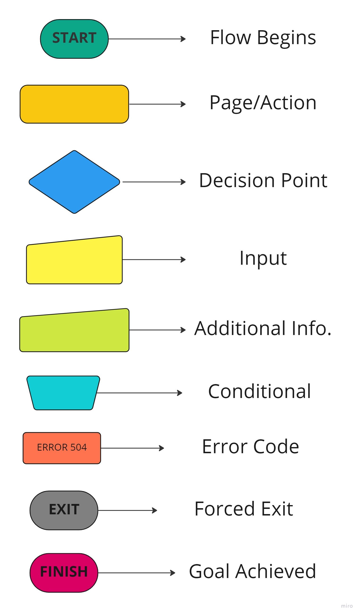
In order to gain insight into the user's journey when searching for an event on social media, a user flow was created, with a particular focus on the process of discovering and participating in an event. This exercise facilitated the identification of key pages that will require development.
Key
Site Mapping
The site map consists of four primary navigation pages that shape the application's structure. The 'Discover' page focuses on event discovery, offering options for searching and applying filters. The “Post” option allows for users to review a recent or reoccurring event, adding their own photos and reviews. The 'My Events' section serves as a hub for users to manage upcoming and past events. Users can create a profile to personalize their settings and manage their activity log.
Affinity Mapping
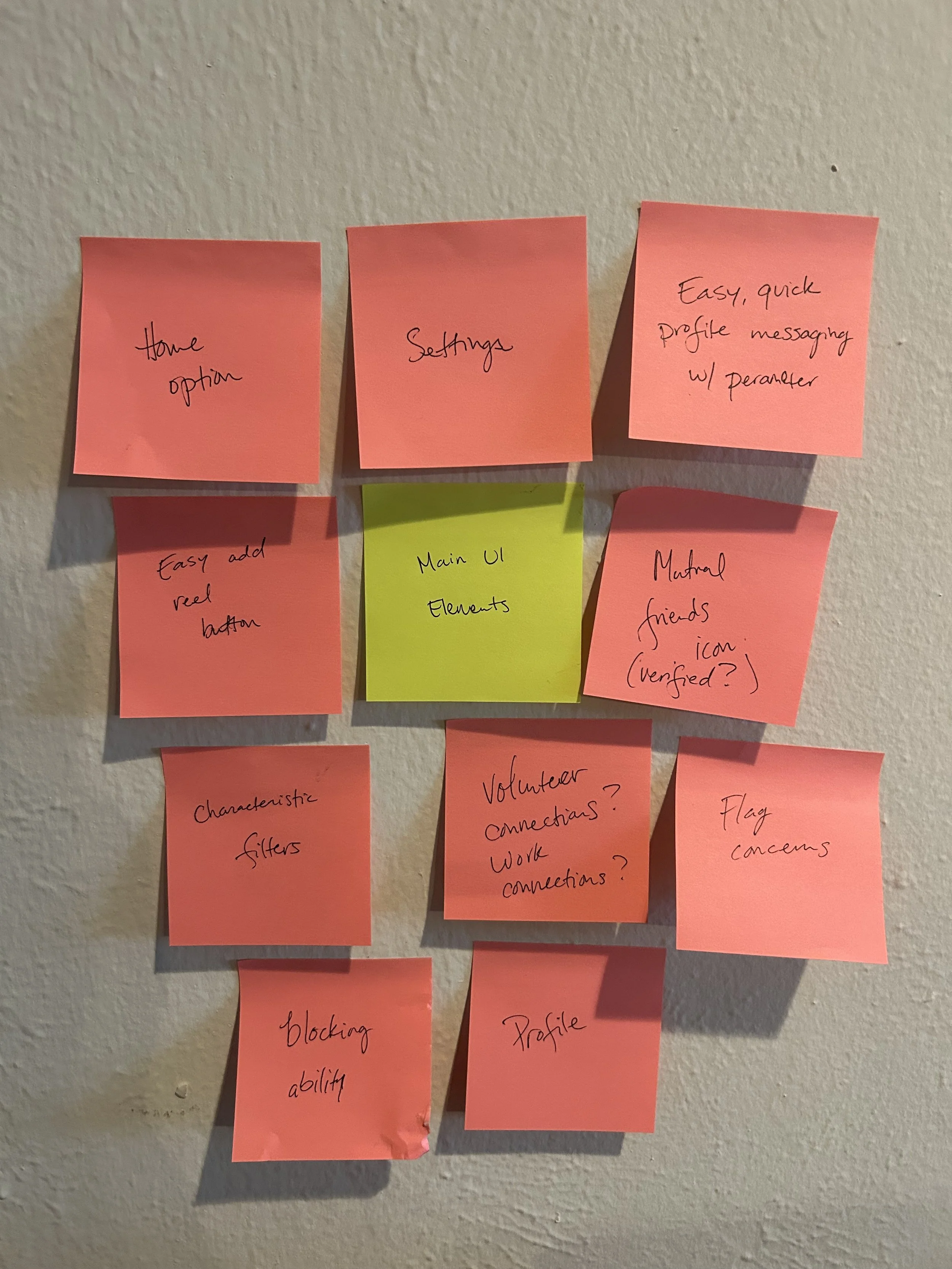
An affinity map was thoughtfully crafted to gain deeper insights into user desires and event categorization. To create this map, a card sort was conducted, drawing from user interview data and the problem definition process. This approach helped organize the information and served as a foundational step in developing critical components of the application.
The mood board served as a pivotal inspiration for shaping the brand personality, embodying four key attributes: Excitement, Connection, Growing Self-Confidence, and Empowerment. These attributes were meticulously chosen to reflect the essence of users who aim to foster personal growth and relate to others based on shared interests and life values. These elements not only inspired the name and logo of the application, "eMerge," encapsulating the concept of emerging personalities and confidence through the convergence of like-minded individuals, but also guided the selection of the color scheme, featuring regal red and gold tones reminiscent of formal events.
Mood Board
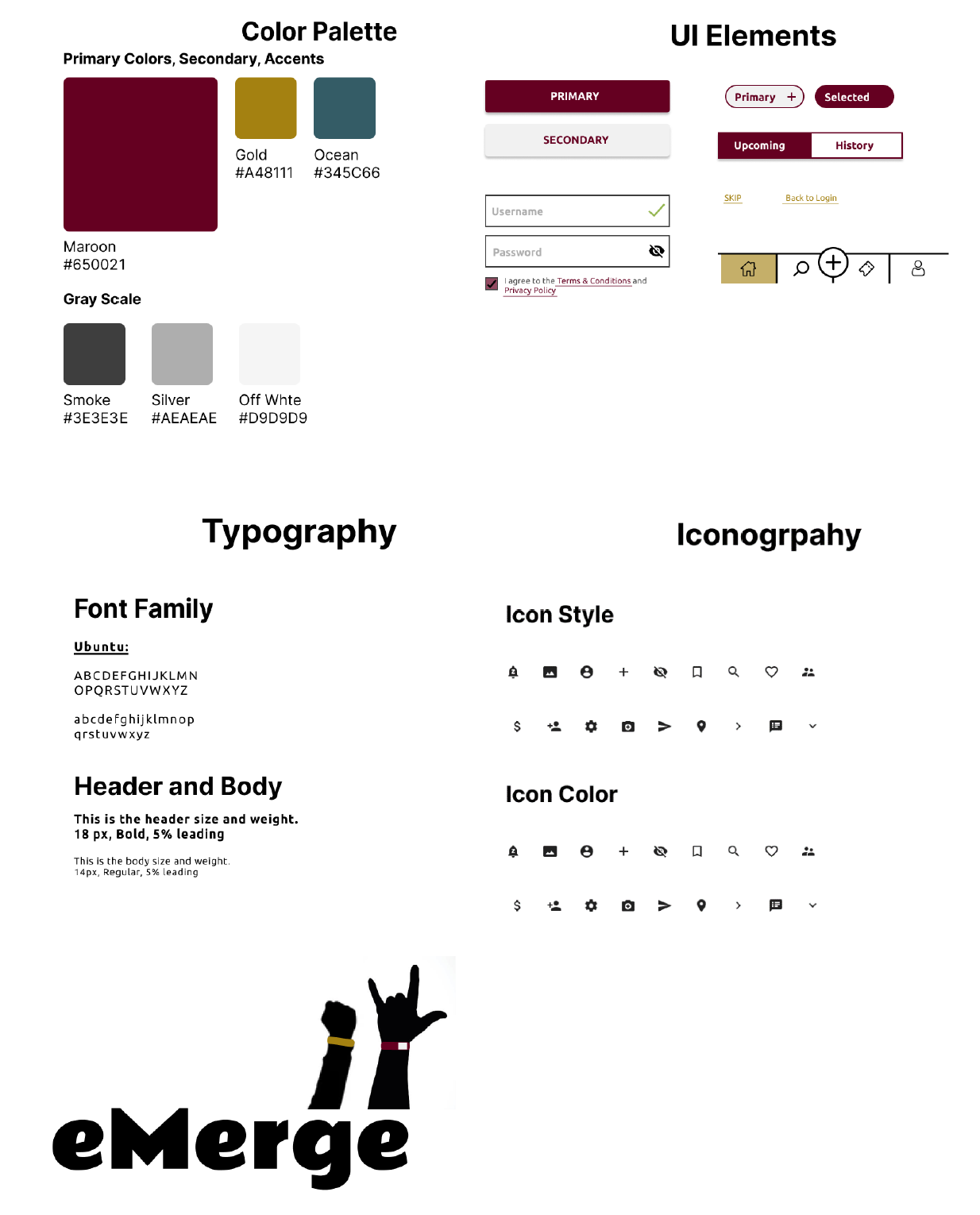
The style guide was meticulously crafted to instill uniformity throughout the entire design process, offering comprehensive guidelines on typography, iconography, color schemes, UI elements, and imagery. This will ensure that as the application evolves in future development and updates, it maintains unwavering consistency in branding and visual elements.
Style Guide
At this stage of the process, we commenced the synthesis of ideas and components that had evolved during the ideation phase. This initiated with preliminary sketches for each of the prospective screens derived from the user flow. Please note that not all sketches are displayed here.
Low-Fidelity Sketches
Once all the sketches were completed, I sought to evaluate the design's cohesiveness by employing guerrilla testing before progressing to the development of low-fidelity wireframes. I established a station at a local coffee shop and approached customers, inviting them to test my prototype. Using the POP app to digitize my sketches, willing participants were able to virtually navigate through my drawings. This testing revealed crucial insights, notably the lack of consistency in certain UI elements. For instance, the scrolling method varied - in some screens, I included a scroll bar, while in others, it was implied that users needed to scroll due to information overflowing off the screen. Ultimately, this experience guided me in omitting components that contributed to a more coherent design, aligning with the principles of aesthetics and minimalism without compromising user comprehension.
Guerilla Testing of Sketches
Wireframes: Low & High- Fidelity
The subsequent step involved crafting wireframes in Figma using the UI elements and sketches. This included infusing life into the application by incorporating my style guide into a high-fidelity wireframe. During this phase, I made several refinements to enhance usability, including the addition of a user-friendly feature to access saved events. The typography, icons, color scheme, and imagery, which are presented below, were integrated for the overall aesthetic of the application.
Usability Testing
I conducted five user tests with individuals in my target age range of 21 to 39 to gather feedback on usability, design, and whether the primary objective of fostering friendships through event attendance could be achieved. These tests revealed a significant design flaw. Participants expressed confusion regarding the review or hosting aspect of the application. It became clear that the review feature was contributing to information overload and wasn't helping users discover upcoming events to attend since the reviewed events had already passed. This issue had diverted my application's purpose and veered it away from the initial objective.
Additionally, users found the color scheme counterproductive, as it conveyed an outdated feel, which detracted from the app's overall user experience. Faced with these critical flaws, I recognized the need to start afresh, leveraging the lessons learned to redefine the problem. This shift was essential in gaining a more profound understanding of the kind of design that would genuinely benefit my target users.
Reiterated Design
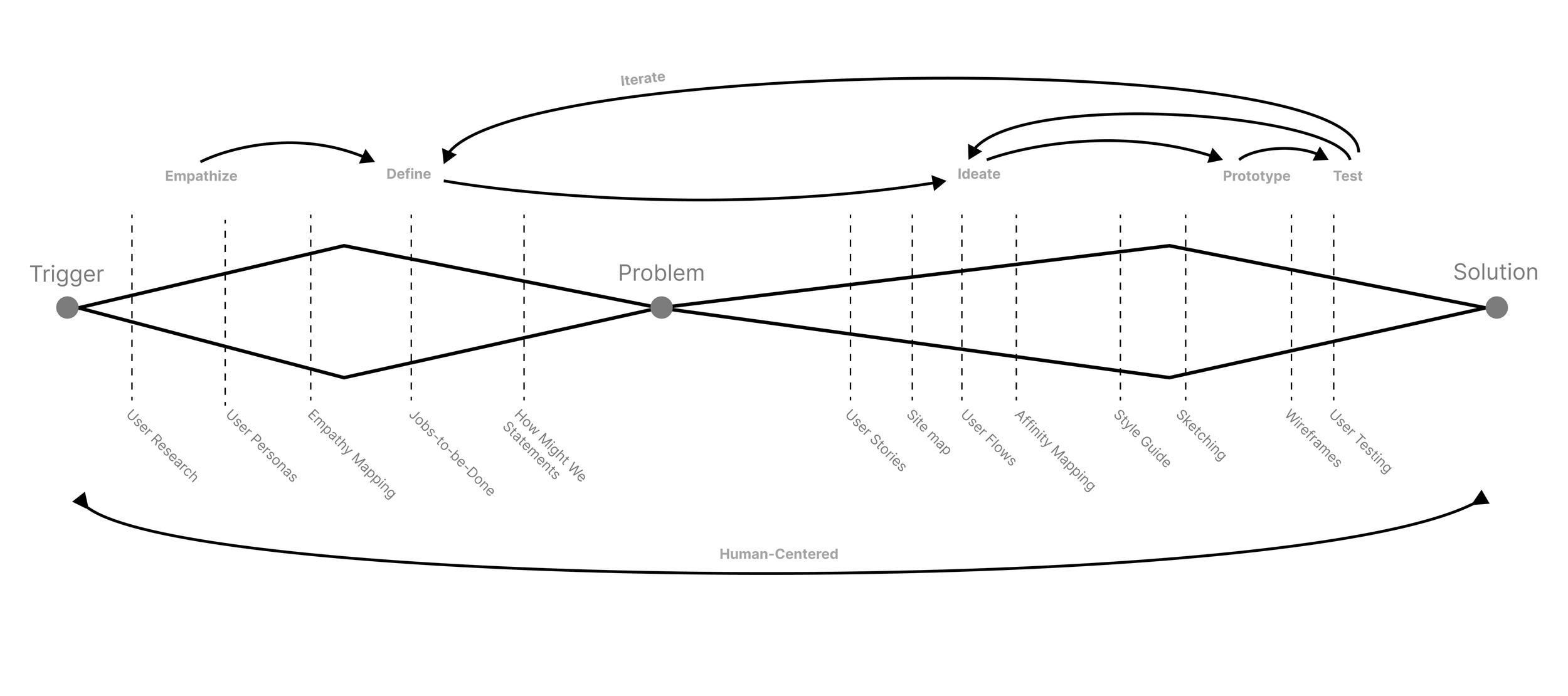
From the Define stage of the design thinking process, I underwent a significant shift in my project's focus, prioritizing user-centered design over the pursuit of the perfect screen. I also extended my exploration to encompass design elements beyond my competitors, seeking inspiration from modern-style apps. Following a process that involved reimagining the concept, sketching, and redeveloping wireframes for prototyping, the resulting design solution is presented below.
Incorporating feedback from another round of user testing, participants lauded this design as contemporary and visually appealing. All five participants expressed a preference for the updated version of the application, recognizing its effectiveness in addressing the core issue of information overload, which had previously hindered their ability to decide on events to attend for the purpose of forging new friendships.


