PostUp
Location Finder Service + Mobile Application

Amidst the challenges brought by the Coronavirus pandemic, individuals who work remotely or employees with intervals between meetings are struggling to find locations, such as coffee shops, that align with their specific amenity requirements, ensuring maximum comfort and productivity. These selected workspaces provide a professional environment while also offering a sense of community involvement, addressing the need to combat social desocialization and fostering a productive and socially connected atmosphere.
Problem Statement:
Must be a mobile application
Must be already established public spaces
Must include a monthly fee for access to application
Users must be able to quickly find needs and amenities
Provided Constraints:
Develop a mobile application designed to empower users in their quest for suitable workspaces like coffee shops or libraries that support remote work. This app will facilitate location discovery, particularly near their current or intermediate positions. Users will have the capability to customize their search by specifying desired amenities crucial to meet their expectations. These amenities encompass considerations like restroom availability, power outlets, dining options, wireless connectivity, and seating preferences.
Probable Solution:
Due to project time constraints, the project manager presented a pre-recorded primary research interview featuring a 32-year-old freelance Copywriter, Nina, residing in Boston, MA. Nina frequently navigates the city for work and prefers remote workspaces. Her work routine involves finding suitable public venues between meetings. The video interview with Nina unearthed several key frustrations, challenges, and user preferences.
One prominent issue that Nina faces is the difficulty in locating suitable public workspaces. Existing competitors often fall short in understanding a location's expected amenities and offerings, which causes frustration. Nina's proposed solutions for her workspace dilemmas typically involve coffee shops known for their seating and available amenities. However, these venues often provide minimal photographic evidence, making the decision-making process time-consuming and inefficient. Moreover, these images sometimes failed to depict the actual workspace, leading to unmet expectations.
Primary User Research
Proximity to the workspace significantly influences Nina's choice.
Nina expects detailed photos of the workspace and its amenities.
Awareness of operating hours and business hours is a crucial consideration.
Noise levels, particularly in quiet locations like libraries, must be conducive for work.
Main Insights
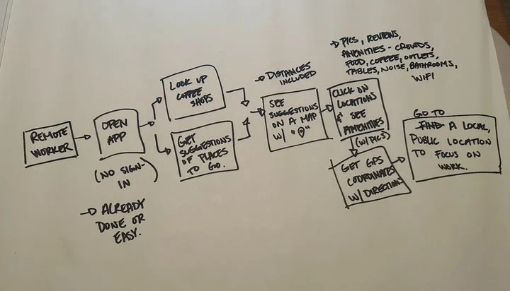
I illustrated a comprehensive end-to-end user experience journey akin to what an individual like Nina might encounter. This journey initiates with remote workers launching the application. They would proceed to search for a specific type of location and receive tailored suggestions. Subsequently, the user would view recommended locations on a map, click on a particular location to reveal additional details, and then select the "go" option to receive directions to the chosen destination. Ideally, following this sequence, they would successfully arrive at their preferred public workspace. This journey allowed for a deep understanding of the experience the project manager desires for their users.
User Journey Mapping (Brainstorming)
Lightening Demos
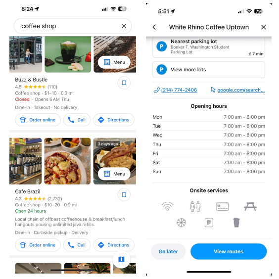
To conduct a comparative analysis, I thoroughly examined numerous applications that incorporate maps into their designs, meticulously noting both commonalities and distinctions. A recurring pattern I observed across all these apps was the presence of indicator tags featuring iconography to facilitate the identification of locations. Moreover, these applications consistently provided images of the destination, estimated time of arrival, mileage, and remaining minutes in the trip, enhancing the overall user experience.
In the subsequent phase of my analysis, I focused on screens showcasing location options and their respective amenities. I identified several design elements that significantly improved the user experience, such as real-time busyness updates, operating hours, the availability of public bathrooms, and even menus for locations offering food and beverages. These design nuances caught my attention as they contributed to improved accessibility and user satisfaction.
Lastly, I compiled my findings into a lightning demo presentation intended for the project manager. This presentation served as a valuable platform to communicate my research results, refine our project objectives, and fine-tune our proposed solution.
Maps & Location Tags
Amenities & Services
The first step in creating my critical screen using the Crazy 8 method involved identifying what this critical screen should entail. To do this, I relied on an affinity mapping technique based on the primary research provided by PostUp. The aim was to determine which factors were of utmost importance to the users in their decision-making process.
Crazy 8 Sketches
Recognizing that the primary commitment in the user journey typically revolves around selecting a location, I decided to focus on a screen where users could access detailed information about a location, thereby making an informed decision. Below, you can view the results of my Crazy 8 sketches. These sketches started from a single concept and evolved as I continued to draw, occasionally overlapping and incorporating robust UI elements.
Among these eight sketches, I determined that the central picture - the last screen - was the most critical screen in a user's decision-making process regarding whether to attend a location or not. This screen would encompass all the essential information required for users to confidently select a location, including proximity, operating hours, and necessary amenities.
At this juncture, I created both "before" and "after" screens to gain a deeper understanding of the user's journey in achieving the ultimate goal of locating a suitable public workspace as a freelance or remote worker. The "before" screen involved setting preferences and specifying the current location, while the "after" screen focused on navigation.
In the process of developing my storyboard, I began by crafting a potential scenario that a user might encounter to establish a starting point. I referenced the user journey map I had previously developed to understand how a user might navigate the app to find a suitable remote working location. While I drew from personal experiences, I aimed to avoid heavy reliance on them to prevent potential biases. Moving on to evaluating UI elements, I used the three critical sketches from day 2 to assess the hierarchy and functionality of these elements. I made necessary edits to elements that seemed less useful or potentially confusing to users. For example, I rephrased the "search" button as it was too vague, making it unclear what users could search for and how to input information. I also realized the need for additional features, such as clarity on the distance component and the inclusion of a user review and feedback section. The review feature is essential to ensure that location ratings reflect the actual experiences of remote workers and freelancers rather than those of the average visitor looking for coffee or books at a library.
Storyboard
Low-Fidelity Mockup and Prototyping
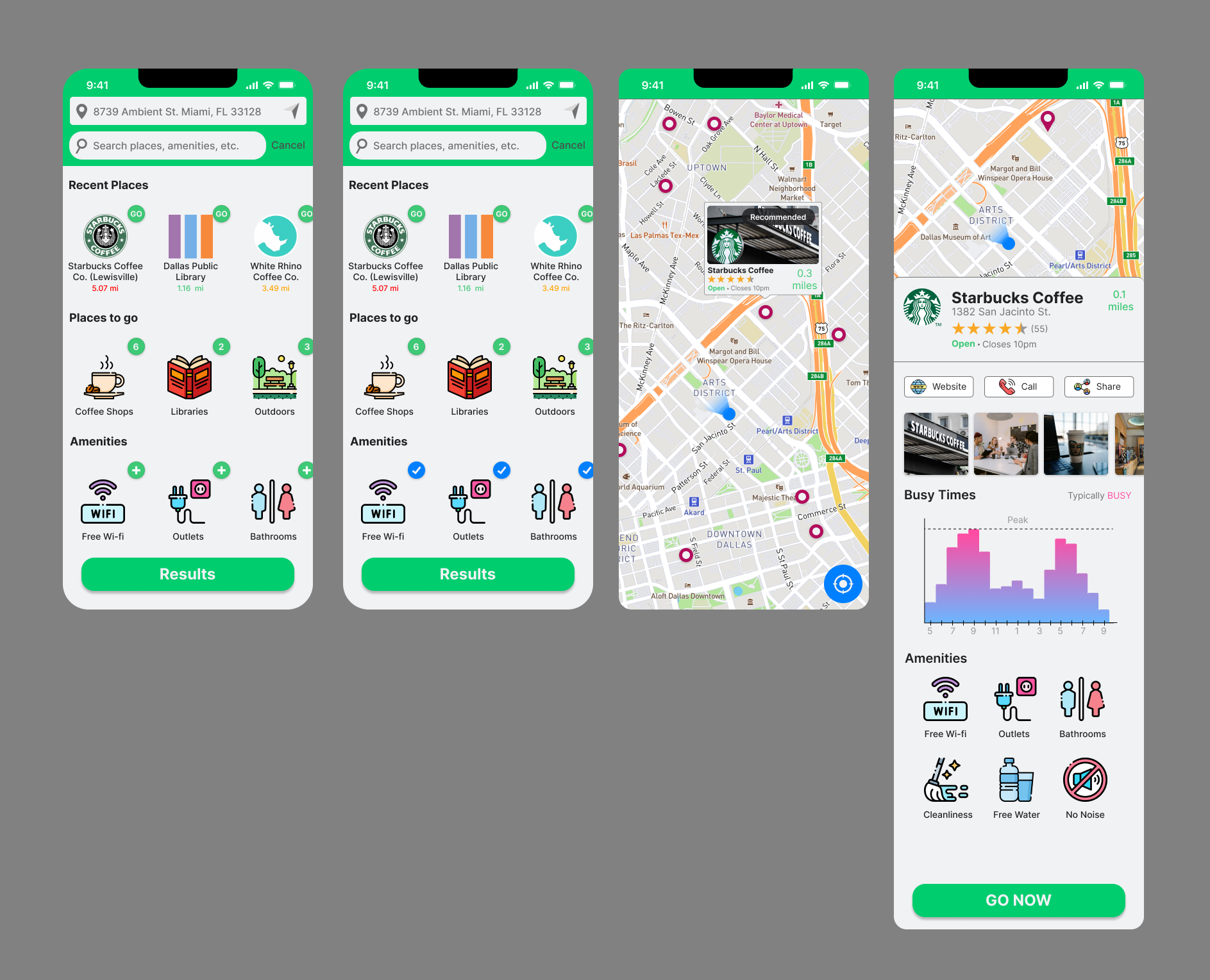
The screens are interconnected through a prototype, enabling the selection of an image on the main screen, which is visually highlighted in green to provide feedback. Upon selecting the "results" button, the map displays, showcasing locations sorted by distance and based on the preferred amenities from the home screen. The function of seat availability was included in the location details, although its accessibility needed clarification from my mentor. Additionally, the app featured a navigation system and a review mechanism to assist users in reaching a public workspace and contributing to location ratings voluntarily. In summary, the initial consensus, considering time constraints and goals, was that the app effectively facilitated the discovery of new public places with necessary amenities but required improvements in terms of color and visual appeal.
User Testing of Mockups
Over a two-week period, I conducted interviews with six remote workers from various companies who occasionally work outside their homes. Four of these workers operate from public locations almost daily, while two do so once a week to break the monotony of their home offices. One interviewee mentioned they never work outside the office because of the discomfort and additional expenses associated with paying for Wi-Fi at public spaces. These interviews yielded valuable insights into my original design. While most participants appreciated the simplicity of the icons and location iconography, many expressed reservations about the lack of color and vibrancy.
For instance, one interviewee commented that the color, although consistent with the company brand, made the application feel like an outdated game rather than a platform for serious work.
The addition of color and consistent iconography is crucial for visual appeal.
Some locations with listed amenities were not conducive for work.
Amenities did not accurately specify the type of seating (e.g., high, wide, cushioned, couch).
There was uncertainty about whether users should create an account or share locations via SMS messenger.
The side-scrolling feature was not clear enough, and the arrows needed enhancement (consider creating horizontal scrolling overflow).
The distinction between "plan a drive" and "directions" required clarification (both in future development).
There was confusion about Wi-Fi, particularly regarding its availability with or without purchase (lack of common understanding).
The star review and "no, thank you" buttons needed to be larger for ease of tapping.
Main Insights
Design Iterations
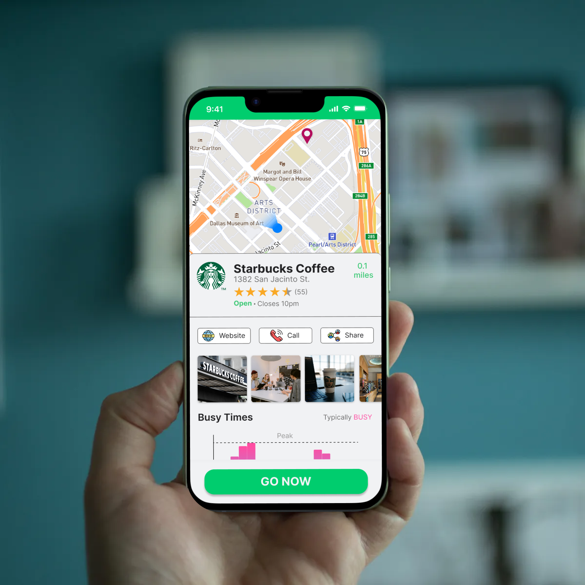
Given the time limitations associated with this design sprint project, it was not feasible to accomplish all of the defined goals, as will be elaborated upon in the conclusion section of this case study. On the subsequent page, you will find the new UI of PostUp. Please take note that, due to time constraints, not all necessary screens were developed, such as the screen for searching while typing or the navigation extension allowing users to select their preferred navigation system.
Conclusion
Upon retesting the aforementioned mobile application UI for "PostUp," several new insights surfaced. If this project had been allocated more than a week, these findings would have been further explored and implemented to enhance the user-centered experience. In conclusion, there are several elements that could be further refined in the future to improve the application's success:
Enhancing Social Interaction: Consider focusing on fostering user engagement through the sharing of tips, resources, and advice among locals or peers. This could involve the creation of a social aspect within the app, such as avatars representing users at specific locations.
Incorporating Missed Screens: Develop screens that were omitted due to time constraints, including features like a monthly fee notification and confirmation, additional navigation options, and a reorganization of amenities as a subpage within filters.
Implementing Incentives: Explore ways to motivate users to contribute information about busy times or seat availability. This could involve implementing an incentive system or gamification elements.
Star Review System: Consider incorporating a review system tailored to users seeking remote work-focused reviews rather than service-based reviews.
Small Design Tweaks: Address minor design inconsistencies, such as the underline stroke between the top green bar on screen 3 and the home page.
Refining User-Centered Design: Realign the design hierarchy to better match the primary task and goals of the application. Ensure that the search bar is appropriately emphasized compared to the current location bar.
Consistency in Design: Adjust any inconsistencies in hierarchy, shape, and visual balance within the application, such as the shape of the search bar versus the current location bar.
Visual Appeal: Take into account user feedback regarding the application's color scheme and balance the aesthetics to meet user preferences.
In summary, this design sprint process has underscored the value of time in UX/UI design. Balancing the need for an MVP with a user-centered approach is crucial. Designers may need to negotiate with stakeholders to secure adequate time for creating a product that inspires confidence. However, this also involves understanding that every application or website can continually improve user accessibility, visual appeal, and overall user experience while reducing user friction.


